
Line Charts are used to show how two parameters are related to each other. Or to put it another how one variable changes as another changes. A Line chart consists of two axis, a vertical or Y axis and a horizontal or X axis.

The most common use of a line chart is to show how a piece of data varies over time. The X-axis generally represents time whilst the Y-axis represents the value. Point are then plotted for each time interval and the points joined by a line. This provides a visual representation of how the data varied over time.
Of course the x-axis does not have to represent time and in fact can represent anything required. The only requirement is that there is some relationship between the X and Y axis.
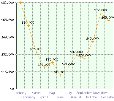
The following line chart shows sales figures for a product by month. The line instantly conveys how sales vary throughout the year.
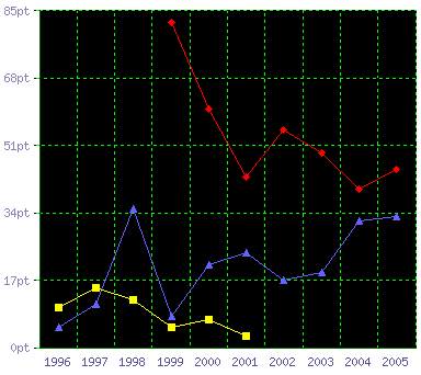
The line chart is also very useful as a comparison tool. By plotting multiple series of data on the same grid it becomes very easy to compare the data sets. The following graph shows points scored by three teams over a ten year period.
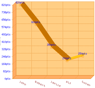
A variation on the line chart is the Ribbon Graph. This is basically a 3D version of the line chart.
Summary
Line charts can be used to display a wide variety of data and relationships. In addition to great visual representation of data they also highlight trends in the data. The human eye is particularly adept at spotting patterns and line charts make this process very easy. This makes the line chart a great choice for keeping an eye on important business metrics.
View more Line chart examples here »