
Pie charts (or sometimes called circle charts) provide a visual representation of data as slices of a pie. The greater the data value the larger the pie slice. The sizes of each slice are calculated such that the total sum of all the data elements will represent the full 360 degree pie circle.

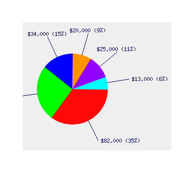
The example below shows a simple 2D version of the pie chart representing sales figures by region. In addition to the absolute dollar value a percentage figure is also calculated for each pie segment.
For a more professional look and greater visual impact the pie can be drawn in 3D. This example shows the pie being drawn with
quite a 3D angle. Of course the 3D angle may varied to provide quite a variety of pie charts.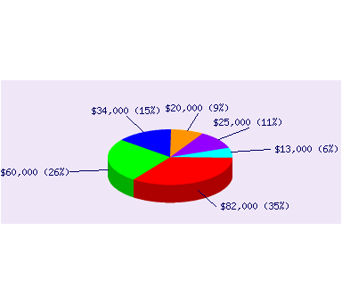
Multiple pie charts can be drawn of varying sizes to provide another dimension to the data.
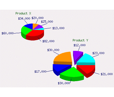
As can be seen the larger pie in this example explodes the pie segments giving a very professional image.
Image Quality
This is particularly important for pie charts. All of the images above have been produced by using a technique known as Anti Aliasing. Basically this means the borders of the pie have been smoothed to provide a much higher quality image. Without this technique the pie segments would look jagged and reduce the visual impact.
Summary
Pie Charts provide a great way to display the proportions of a set of data. The human eye can easily see the ratios between the individual data items. This makes the pie chart the ideal tool for displaying any series of data where relative value is important.
View more pie chart examples here »