Today bar charts and graphs are used everywhere and there are many forms and variations, but where invented them and where did they come from?
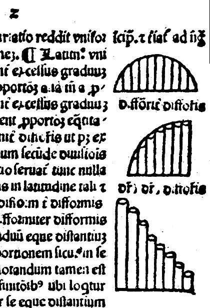
Many sources credit William Playfair (circa 1780) with inventing the bar chart, however a Frenchman, Nicole Oresme used a bar chart in a 14th century publication, "The Latitude of Forms", to plot velocity of a constantly accelerating object against time. Those of you who studied physics will know that Sir Isaac Newton is accredited with first writing down the laws of motion, however it's interesting to note that here some 300 years before Newton, someone else had a grasp of velocity and acceleration. In this very early graph Nicole plots time along the horizontal axis and velocity of an object along the vertical axis. The length of the bar represents the velocity of the object at each moment in time. Although taken for granted it's important to note that each bar is of equal width and this feature has remained as one of the fundamental rules of most forms of bar type graphs to this very day.

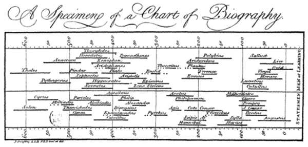
In 1765 Joseph Priestley published a timeline type graph upon which he plotted horizontal bars. Although not one of the more usual forms it is still a bar style chart.

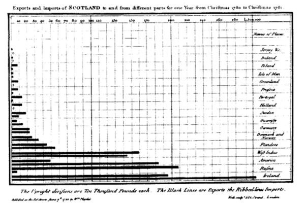
Moving on 20 years and we finally get to William Playfair who again utilised bar charts in his publication to show imports/exports of Scotland. This is the first example of numerical data being split into discrete groups and plotted as bars and hence the reason William is credited with the invention of the bar chart.

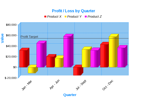
Today bar charts and graphs are easy for us to incorporate into all sorts of publications both physical and digital. There is a variety of software available which enables almost anyone to create bar charts from a set of numbers. Below is a modern example where a 3D bar chart is used to compare Profit/Loss for 3 products by Quarter. Individual sales data is rolled up into discrete periods of time, in this case Quarters, and the total figure plotted as the height of each bar.

JPowered provides software to enable web developers to easily incorporate dynamic graphs and charts into web sites and applications.
Web Page Graphing Documentation
A series of easy to follow Tutorials have been produced to enable quick development and show some of the more advanced and dynamic applications.