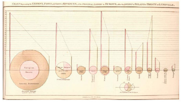
The pie chart diagram dates all the way back to 1801 when William Playfair produced a publication 'The Statistical Breviary' that contained the following pie diagram:-

Looking at this early example we can that all the basics of pie chart are the same today as they were over 200 years ago. The pie is split into segments where the angle is proportional to the data item represented. Each segment is colored although today colors used tend to be far more vibrant.
Although widely used today the pie chart was not immediately taken up. Following William Playfair's publication the pie did not appear again until 1858 when a French engineer Charles Joseph Minard began using pie charts to represent an extra dimension to data.
There are today many variations of the pie chart including Polar Area Diagrams, Spie Charts, Radial Charts, Exploded pie charts, 3D Pie Charts and Doughnut Charts. However still the most common use is the simple pie chart as depicted in these early examples.
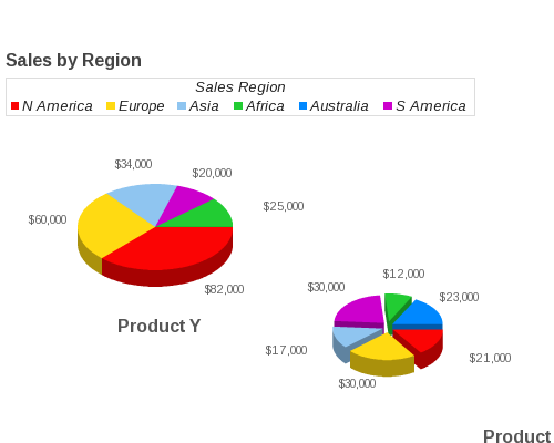
Here is an example of a modern use of the pie chart used to display sales by region. As can be seen the basic principles have not changed in over 200 years. A circle is divided into segments where each segment represents one piece of data. Each segment's angle is proportional to the value of the piece of data. Here multiple pie charts are displayed in 3D mode.

JPowered provides software to enable web developers to easily incorporate dynamic graphs and charts into web sites and applications.
Web Page Graphing Documentation
A series of easy to follow Tutorials have been produced to enable quick development and show some of the more advanced and dynamic applications.