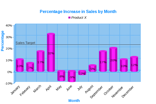
A variation on the classic bar graph is the cylinder chart. Like bar graphs, cylinder charts are a great way to group data and enable the viewer to make comparisons between those groups. In this first example the bar graph is used to show the percentage increase / decrease in sales figures on a month by month basis. Note that in this exmample a 'Target' line has been added to provide the viewer with another quick way to compare all the data against a general sales target.
Cylinder charts can also be used to display different series of data on the same chart. This example show the profit and loss figures for 3 products grouped by quarter
JPowered provides software to enable web developers to easily incorporate dynamic graphs and charts into web sites and applications.
Web Page Graphing Documentation
A series of easy to follow Tutorials have been produced to enable quick development and show some of the more advanced and dynamic applications.