We all know that a well thought out site with clear layout and navigation makes the whole user experience far more pleasing for a visitor and encourages repeat and longer visits. So why then, when it comes to presenting numerical information do the majority of web developers get this so wrong?
Web site design has gone through many evolutions with techniques coming and going. Most of this evolution has revolved around page layout and site navigation, today a modern site does indeed present a clear and easy experience for the visitor. However one area that seems to have been neglected is the display of numerical information. Perhaps this is due, in part, to that fact that not every site has numerical data to display or perhaps web designers are so focussed on look and feel that they neglect the clarity of information.
Getting visitors to a site is quite a task as we all know. So when we get them there we want them stay and understand the content. If that content involves numerical data then isnt it worth making a little extra effort to present that data in a format that is both pleasing to the eye and enticing. So how do we do that ? Well when you start to think about it, it really isnt any different to the way we approach general site design. Today we wouldnt dream of just chucking all the content at random on a page and expecting the visitor to make sense of it. So rather than just take the raw numbers and throw them into a table lets give it a little thought. Think about what the data could be saying to user and then start to break it down into headline numbers and paragraphs as you would do with text information.
Numerical data can usually be quite easily segmented and totalled. Summing sections of data provide headline attention grabbing numbers, whilst segmenting provides the opportunity to paragraph the data making far more information easily accessible and far more interesting for the viewer. For example, lets suppose we have a whole series of sales data and lets imagine our organisation sells four products. Our raw data is a set of individual sales numbers. Simply placing this data in one big table, although displaying all the data, does not really provide very much information. For instance a normal user would have no idea which product is most popular or whether there are any trends or seasonal variations. With a little thought and effort we can do much better, lets start by segmenting our sales figures by month and then within each month segment further by product. For each product / month cell we have two numbers, the total value of sales and the number of sales. Providing this in just a simple table will be far more meaningful than our original raw data set. The user can now begin to see which product is performing well and also whether any particular time of year is good or bad. However we can still do much better.
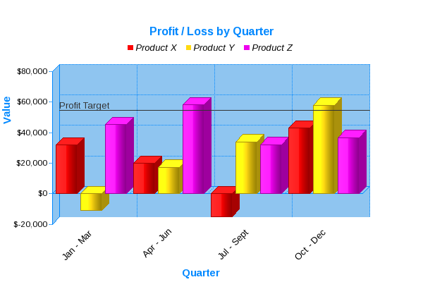
Even at this level of segmentation we are still making the viewer work to see the story contained within the data. Now that we have the data sensibly segmented it becomes a fairly easy task to display in graphical format. Done well graphs are extremely powerful because they both present information in a visual format and add dimension to the data. Relationships between adjacent data and trends across the range are made crystal clear. Choosing the correct chart style is key for making this work really well. Should we use pie charts, bar graphs, line graphs and something more exotic. In our sales data example remember we are looking to provide some attention grabbing headline followed by a paragraph of interesting detail. A viewer of our information may first be most interested in which of our products is the best performing. Although a bar graph of total sales for each product would provide this information, a pie chart representing the product totals would be more attention grabbing. So for our headline lets provide the user with a pie chart of total sales. Now all we need to do is provide the paragraph, well the choice with our example data is a multi-series vertical bar chart. We have a series of data for each product segmented by month. Along the x-axis we will plot month and the y-axis will represent value of sales. Each month on the graph will contain 3 bars, one for each product. This simple approach provides the viewer with a great deal of information in one pleasing view. The bar chart tells the complete sales story for each of our products showing both trends and easy visual comparisons.
Thats all well and good, I hear you say, but web pages dont lend themselves to easily generating graphical display. Well thats true but there are today a wide variety of software packages that have specifically been designed to plugin to web sites and make the task of turning the numbers into eye catching, story telling graphs easy for the web designer. Generally you set a few options, like colours and then simply provide the segmented data to the software. At page view time your visitor is presented with the graph image.
In summary then, with a little thought and a small amount of effort the numbers can really be brought alive and provide a compelling story for visitors.

JPowered provides software to enable web developers to easily incorporate dynamic graphs and charts into web sites and applications.
Web Page Graphing Documentation
A series of easy to follow Tutorials have been produced to enable quick development and show some of the more advanced and dynamic applications.